Top Ten Tuesday is a meme hosted by The Broke and the Bookish. Today’s topic is Top Ten Book Cover Trends (or just elements of covers) I Like/Dislike. My favorite covers are pretty similar at least in terms of design elements, and that is that most of them feature a great picture (photograph or realistic illustration) that takes up the entire cover, and there’s awesome font over it. That may sound like a lot of book covers, but I’m very particular about what pictures I like, what fonts I like, and some include other elements like weird graphics that I don’t really love. Here are some that really stand out to me (in no particular order)…
 Just a gorgeous picture with perfectly minimalist font.
 I love just how dramatic the font and the picture feel together, especially with her holding onto the R and with the font being sideways.
3. For Darkness Shows the Stars/Across a Star-Swept Sea
 Stars + dresses + scrolling script = beautiful!
 I tend to prefer photographs or realistic pictures of people over illustrations, but The Grisha trilogy art is just beautiful!
 The font is nice, but the real stars of these covers are the dresses!
6. Splintered
 The bugs and the plants being so close to her face bothers me some, but overall still a gorgeous cover!
 This cover is so stinking cute!
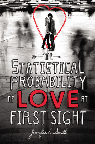
 This is a bit of cheat because the picture if overlaid by a graphic that the font is on, but still, it’s too pretty not to include!
9. The Statistical Probability of Love at First Sight
10. The Noble Groom
 I almost bought this book for its cover, but I learned that I could get it from the library so I refrained. The swirls on the font though! Love it!
What are some of your favorite covers with the great picture + great font combo?
P.S. For anyone who’s interested, I did decide to start a Tumblr! *nervous* Check it out if you so desire!


